I’m sure like everyone else you have searched the web for something you want, landed on a website but then quickly deserted it to look elsewhere.
What is it that made you turn away from that website?
For most people, common reasons include the website taking too long to load, it wasn’t simple to find the item you were looking for, or the overall look of the website was too cheap and amateurish to trust with your credit card.
As a customer browsing the web we have a vast array of choice to choose from, so if one particular website doesn’t satisfy your demand then it’s usually easy to find another which does, so we can be picky.
We know this to be true when we’re browsing the web, so why should it be different for would-be-travellers looking to purchase their dream holiday on your website?
The answer is it isn’t.
So what does this mean for the design of your travel website?
There’s a commonly used rule known the “3 second rule”. It quite simply refers to the roughly 3 second timeframe you have to capture the user’s attention before they’ll choose to go elsewhere.
If you have a website that in itself takes three seconds to load then you’ll literally be losing a high percentage of your potential travellers who will have lost patience.
If your website doesn’t quickly convey who are you are, what holidays you offer and what they should do next (call-to-action), then again, potential customers will lose interest and go elsewhere.
Of course, this doesn’t mean you have to have blocks of descriptive text specifically outlining who are you, what you do and why you’re a great company; this will fall foul of the 3 second rule in itself. Instead, the whole design of the website, including the imagery, should quickly convey to the user who you are, what you do and that you’re a trust-worthy company to deal with (a very important issue for most customers, given the cost of holidays).
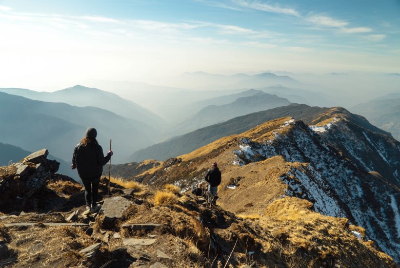
On travel sites it’s often large, high quality imagery that works best when it comes to capturing people’s attention and imagination. An intelligently design travel site will also incorporate design features that make the website a breeze navigate, makes the user know they’re dealing with a professional, high-regarded company and efficiently converts potential customers browsing the site into paying customers.
As you can imagine, we have seen thousands of websites - some good and some bad. The concepts outlined above are common sense and something we all know from our own experience browsing the web, but strangely many website owners don’t think of the potential custom their own websites are losing from being poor designed or hosted on a slow, sub-par server.
For those who do look to correct their websites flaws, the results can outstanding:
A travel website we designed for a new client reduced their bounce rate from 95% of visitors to just 5% and visitors now stay on the site for 4 minutes at a time! All this was achieved from simply designing a beautiful website which followed these customer-friendly rules.
To be clear, their previous website was losing 95% of their potential customers who were going elsewhere. Their new website now retains the vast majority of users which become highly engaged with the content, with the average visitor staying for four minutes, often before going on to book.
Your travel website could also become a success story. If you’d like a fresh pair of expert eyes take a look over your existing site, feel free to get in touch.
The Travel Web Design Blog